Content & Block Types
Typography • Content & Block Types • Iconography • Block Regions
Drupal is a database-driven content management system. We've built out the infrastructure of your Drupal content management system in such a way that, when you select the type of content you want to create (i.e. blog post, basic page, event, etc.), the system will select the right template to design the page, based on your choice. In some cases, your content will also be automatically placed on your website in a location designed for that piece of content. For example, if you create a blog post using the Article content type, it will automatically appear on the blog listing page as well as in blocks that show recent posts.
This page will give you an understanding of the different content options you can use throughout your website.
Content Types
Content types are different pages that have a templated layout associated with them. When you create a page of content from a content type, it will create a page with a URL. The basic approach of creating and editing each type of content is the same. You'll see different options available to you depending on what that content type will allow.
Overview of managing content.
How to add new pages of content.
How to add to & manage menus.
|
Content Type |
Description |
|
Article |
Articles are generally used for pages considered time-sensitive. Examples are news articles, press releases, or blog posts. By default, the article content type doesn't distinguish between different categories or topics, but tags can be added to differentiate types of content and enable listing pages depending that display certain types of content. |
|
Basic Page |
Basic Pages are used for simple, static pages of content. Additional elements such as sidebar blocks or full-region elements above or below the content of the page can be added in regions using blocks. |
|
Directory Entry |
Directory Entries are used to add new people to your directory. A new Directory Entry will be automatically added to your directory page and sorted based on your site's configuration. |
|
Gallery Photo |
Your photo gallery is made up 'pages' of content called Gallery Photo. Each time you add a new Gallery Photo, you will be adding to your gallery. The gallery uses a variety of views to display your photos depending on how your website is set up. These views include a photo gallery page and a variety of blocks. |
|
Landing Page |
A landing page can be used for something as simple as a contact page or can be the core of your digital marketing campaign. You can redirect people to a custom thank you page when they have completed the form. The top of a landing page functions exactly like a basic page, with a few added options. The most important option is to add a webform. You'll need to create the webform before you can add it to the page. The other two options are: (1) Hide the navigation. This is useful if you want the site visitor to focus on your desired action (filling out the form). (2) Have the form stacked or side-by-side. |
|
Pillar Navigation |
The top of a pillar page functions exactly like a basic page. Below the main content, you can add sections which allow for three design options: banner, background, and icon. You can upload an image and add blocks of text to help users navigate to other sections or pages of the site. |
|
Testimonial |
Use this content type to create new testimonials. They will automatically appear in their appropriate locations throughout your website. |
Block Types
Block types are similar to content types in that they are unique pieces of content that have templates associated with them. They differ from content types in that they create blocks that can be put into regions on a page instead of creating a page. You can have blocks that go into any region but some of the blocks below are best suited for certain regions.
Regions and blocks overview.
How to add a block to a page.
How to add an advanced block to a page.
|
Block Type |
Description |
|
The address block allows for displaying your address in the proper format. Typically it will be used in the footer for your full address but can be placed just about anywhere. Often, we'll use this for your phone number in places like the header and it will automatically make it clickable for mobile devices. The title of the block is always hidden regardless of the display title selection when configuring the block. |
|
|
Basic Block |
The basic block is literally the most basic of block types. It only has a title and a body. You can add whatever you like and put it in whatever location you would like. The title of the block is visible based on the display title selection when configuring the block. |
|
The card block is an advanced block that allows a variety of styling options. The card settings provide for spacing and text alignment. You'll have three card styles to choose from: (1) Bootstrap's basic card style, (2) Bootstrap's image cap style, (3) Simplified Card Style. Card blocks are great for calls-to-action. Depending on the spacing setting, you can likely put this block in most regions. The title of the block is always hidden regardless of the display title selection when configuring the block. |
|
|
Definition Block |
The definition blocks allows for a table view of definitions. You'll have two columns: the item title and the item definition. The title has an option to adjust the width. This table is an example of the definition block type as is the content type table above. |
|
This magic accordion allows you to have a tabbed/accordion design in a region on your site. You can have it appear as a tabbed view on desktops and an accordion view on mobile devices. You can also have this block display as an accordion view for all devices. |
|
|
Simple Block |
A simple block functions much like a basic block but adds an image upload field. When using this image upload field it appears in the same spot each time and has the same styling applied each time. The title of the block is visible based on the display title selection when configuring the block. |
|
The social link block type provides a simple menu where you can select the social icons you deem appropriate. Your administrator can add additional icon options to meet your needs. The title of the block is always hidden regardless of the display title selection when configuring the block. |
|
|
Sometimes you need a block vertically aligned in a region. You'll be able to set the height of this block and then whatever is included in the body will be vertically centered. Usually this will be used in full-width regions such as a postscript-region. The title of the block is always hidden regardless of the display title selection when configuring the block. |
|
|
If you'd like a video link in a sidebar that pops out into a window for playing, this block type will do that for you. You'll add a YouTube link and YouTube will provide a thumbnail. When the visitor clicks on the thumbnail, the video will pop-up and play. |
|
|
Hero Banner |
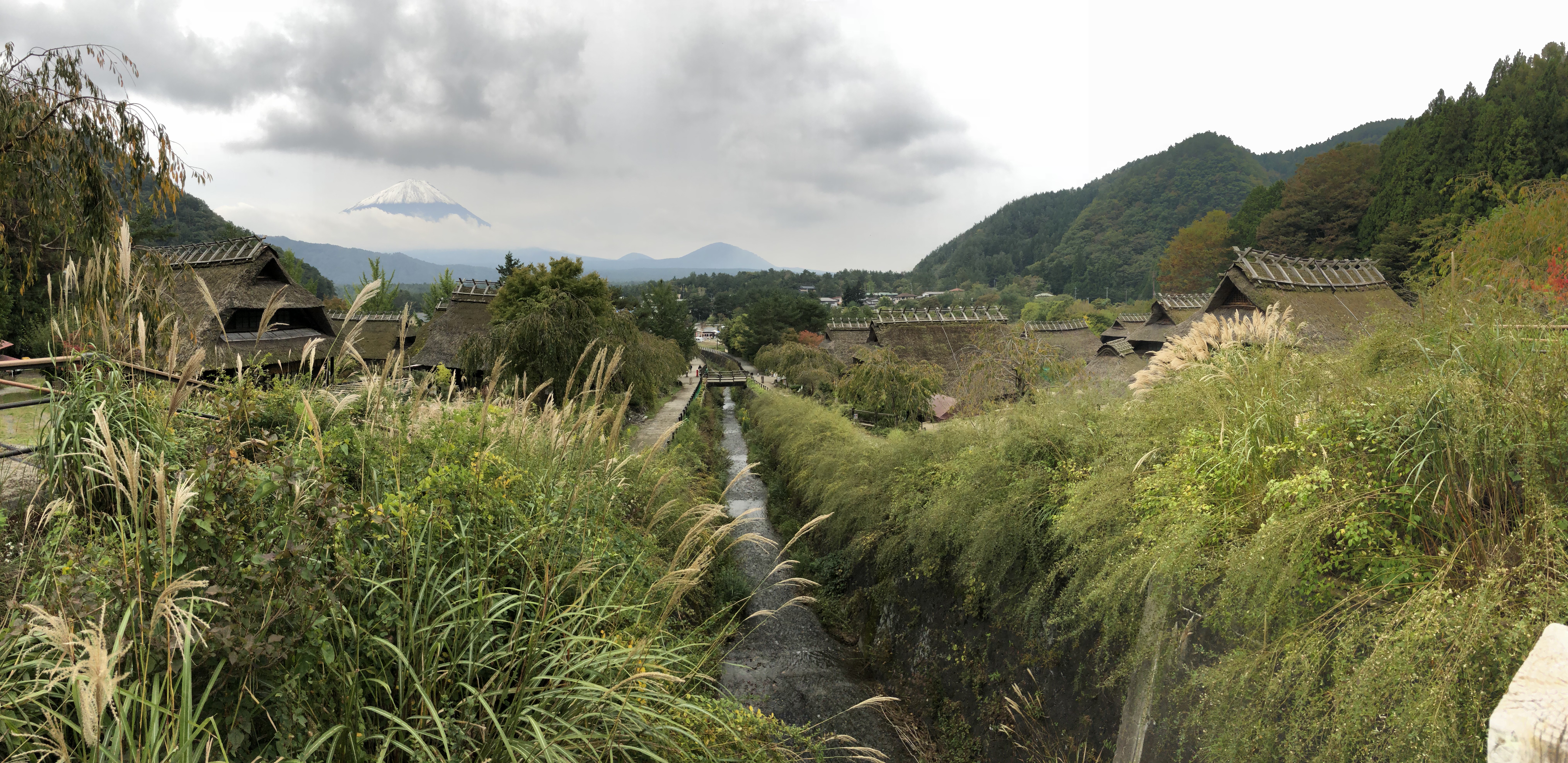
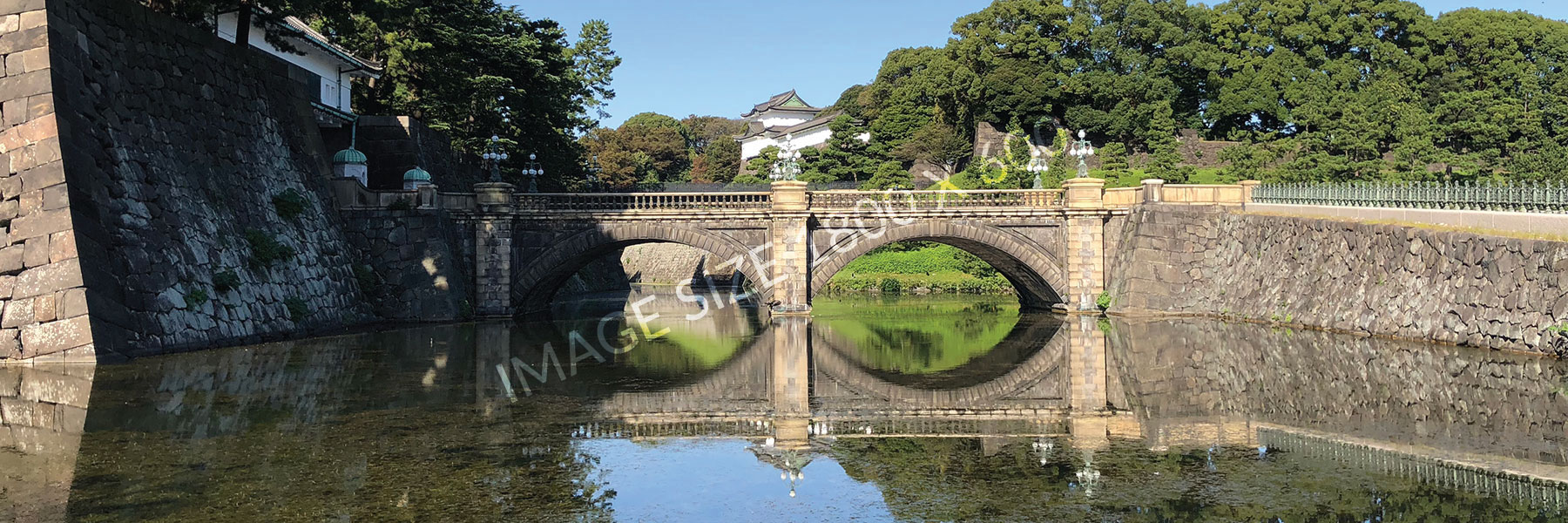
The hero banner is the main banner of a fully designed page. The most common usage of a hero banner is the home page. This hero banner block includes a static image (including alignment settings for mobile devices), static messaging and call-to-action links. It's recommended that this only appear in the banner region at the top of pages. It will likely work fine in other full-width regions. The background image will stay full-size regardless of the screen size but will simply crop the image. Use this hero banner if you do not have multiple images for each of the screen sizes as it will automatically align the background image for you. The title of the block is always hidden regardless of the display title selection when configuring the block. |
|
Hero Banner 2 |
Hero banner 2 is an advanced alternative to the hero banner. The key difference is that you have the ability to upload different image sizes for the different screen sizes. It takes a little more planning and photoshop work but it allows you control over how the image crops at different screen sizes. You are required to upload images for a minimum of the XL and LG screen sizes but it's recommended you upload a different image for each of the 5 screen sizes. The title of the block is always hidden regardless of the display title selection when configuring the block. |
Address Block
Card Block
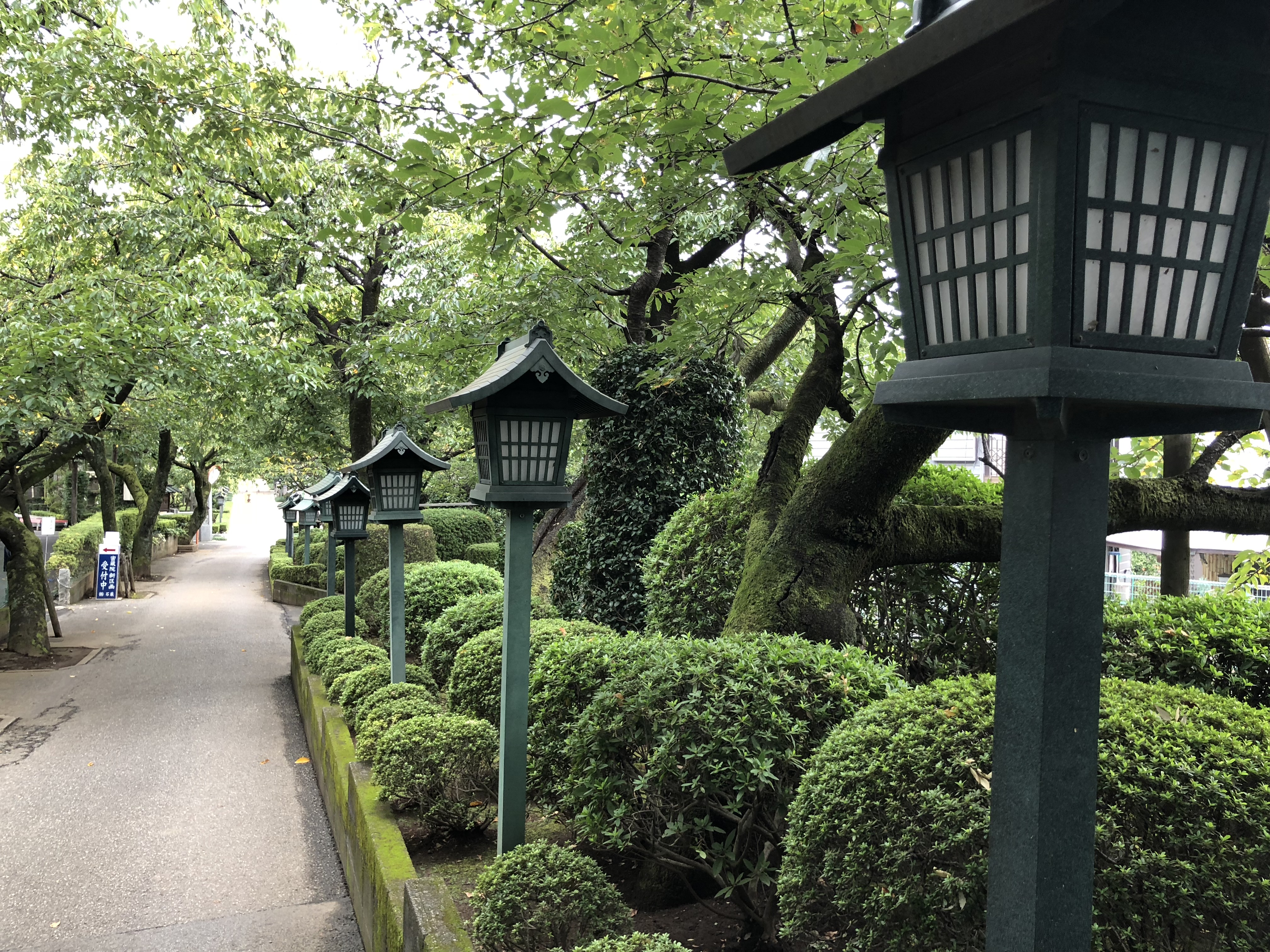
Card Image Cap
Basic Card
Vertical Middle Block
This is a sample of a vertical middle alignment.
The styling options are super simple. This example has style 4 applied.
Video Block
If you need content below the block, you can add it here.
Magic Accordion Block
This magic accordion is designed to provide multiple options in the design of a very stylized block. Many times it's best to have a block of content in a tabbed format. The challenge is that tabbed content in a mobile device usually doesn't work well. That why this is magic. When you create content that is tabbed on a desktop, it will magically appear as an accordion view on mobile devices.
This block has a variety of settings including: have it always be an accordion, how wide the tabs should be, the text alignment in the description area, changing the font size of the headers and description areas, and a dark/light theme.
-
When viewed in tabbed mode no text from a tab is visible if you are not hovering over a tab. As such, there is an option to add default text that will appear when no tab is hovered. In accordion mode, this default text will not appear. You can choose to have no default text.
-
Theme Settings
Theme options:
- Light - Title Description
- Dark - Title Description
- Light - Title Description
- Dark - Title Description
-
Font sizes
Font size options
- Default
- Big
- Bigger
- Biggest
- Default
- Big
- Bigger
- Biggest
-
Tab Widths
Tab widths are only applied when the tab view is enabled. As such, tab widths will never be apparent on accordion views. Tab widths can be 200px to 450px in 50px increments.
-
Tabbed/Accordion
The tabbed mode will appear on desktops. Accordion mode will appear on on mobile devices. You can set it so that it will never be viewed in tabbed mode. That is good when you have a higher amount of text.
-
Height
The height of the description box for tabbed mode is based entirely on how many tabs are present. If you find that your text overflows you'll either need to add additional tabs or change to view in accordion only mode.
-
Formatting
 You can add images, buttons or other formatting. If you want to use this feature with a lot of images/formatting, then you might need to select accordion only view.
Theme options:
Font size options
Tab widths are only applied when the tab view is enabled. As such, tab widths will never be apparent on accordion views. Tab widths can be 200px to 450px in 50px increments.
The tabbed mode will appear on desktops. Accordion mode will appear on on mobile devices. You can set it so that it will never be viewed in tabbed mode. That is good when you have a higher amount of text.
The height of the description box for tabbed mode is based entirely on how many tabs are present. If you find that your text overflows you'll either need to add additional tabs or change to view in accordion only mode.
 You can add images, buttons or other formatting. If you want to use this feature with a lot of images/formatting, then you might need to select accordion only view.
Theme options:
- Light - Title Description
- Dark - Title Description
Theme options:
- Light - Title Description
- Dark - Title Description
Font size options
- Default
- Big
- Bigger
- Biggest
Font size options
- Default
- Big
- Bigger
- Biggest
Tab widths are only applied when the tab view is enabled. As such, tab widths will never be apparent on accordion views. Tab widths can be 200px to 450px in 50px increments.
Tab widths are only applied when the tab view is enabled. As such, tab widths will never be apparent on accordion views. Tab widths can be 200px to 450px in 50px increments.
The tabbed mode will appear on desktops. Accordion mode will appear on on mobile devices. You can set it so that it will never be viewed in tabbed mode. That is good when you have a higher amount of text.
The tabbed mode will appear on desktops. Accordion mode will appear on on mobile devices. You can set it so that it will never be viewed in tabbed mode. That is good when you have a higher amount of text.
The height of the description box for tabbed mode is based entirely on how many tabs are present. If you find that your text overflows you'll either need to add additional tabs or change to view in accordion only mode.
The height of the description box for tabbed mode is based entirely on how many tabs are present. If you find that your text overflows you'll either need to add additional tabs or change to view in accordion only mode.
 You can add images, buttons or other formatting. If you want to use this feature with a lot of images/formatting, then you might need to select accordion only view.
 You can add images, buttons or other formatting. If you want to use this feature with a lot of images/formatting, then you might need to select accordion only view.
